BRANDING
Visualising a unique and spot-on organisation's identity
Zero21 specialises in building visually strong brands. While branding is a broad discipline, Zero21's power is to create a unique brand experience that works seamlessly across all media, based on the organisation's brand essence – the organisation's 'Why'. The
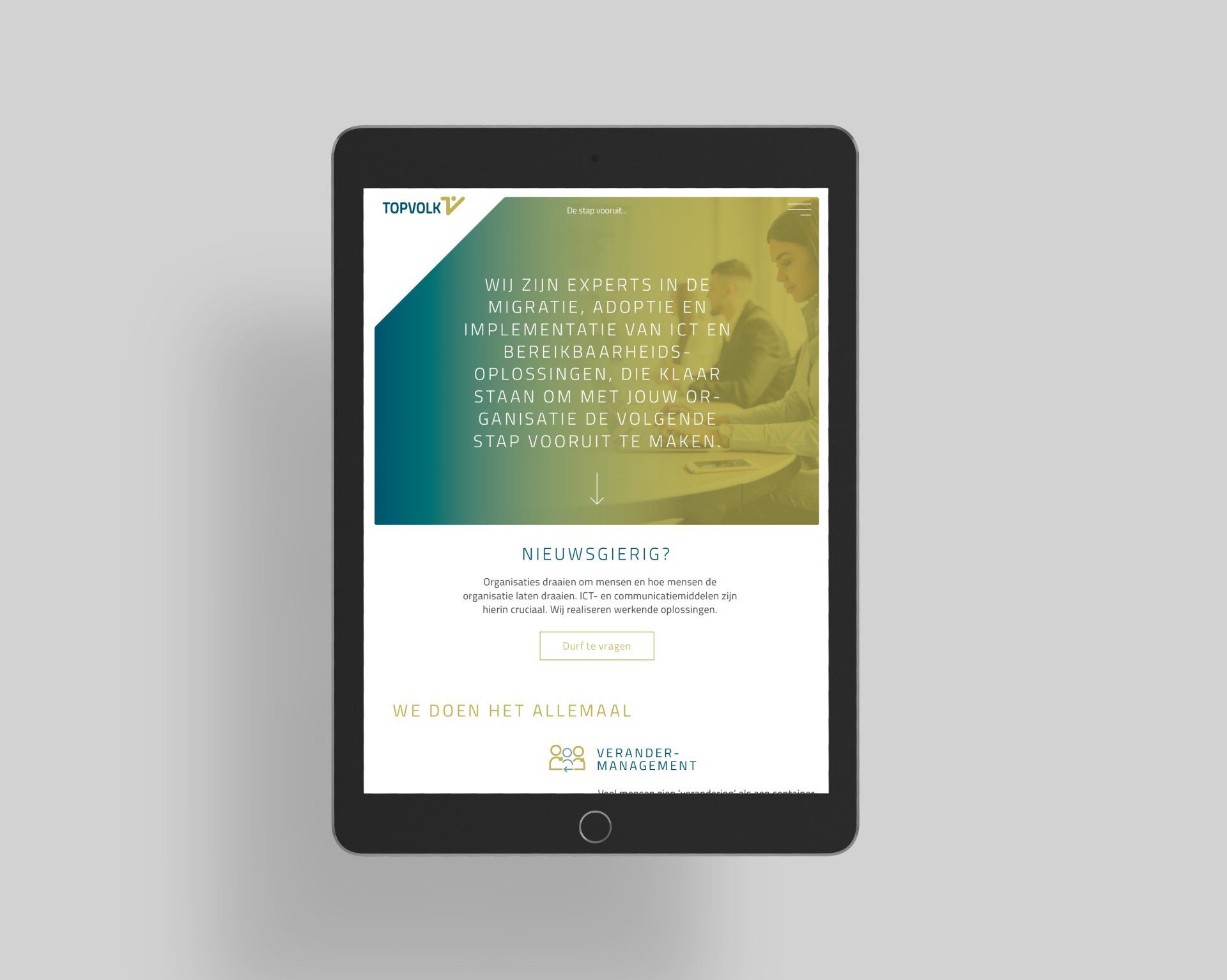
Topvolk visual identity, below, gives an idea of what it takes to create a strong brand.
/// THE 'WHY'
Your 'Why' statement is a sentence that clearly expresses your unique contribution and impact. The impact reflects the difference you want to make in the world, and the contribution is the primary action that you take towards making your impact.. From this statement we create brands that are able to distinguish themselves holistically from the start and from that moment on are able to uniquely captivate, engage and connect for a long time.
Zero21 strives to develop brands that are timeless, yet contemporary. And who can also keep up with the rapidly changing world and the changing way of how the public experience and value brands. Zero21 create brands that appear visually simple and accessible and therefore intuitively convey a deeper, lasting message. Like the brandmark for consultancy agency Topvolk, communicating the step forward you will make by hiring them:

Slide title
Write your caption here
Button
/// THE BEATING HEART OF A BRAND
The brandmark is often the beating heart of a brand – the icon that carries the values and belief of the brand. The logos developed by Zero21 possess this visual power. Often the message is immediately visible, but sometimes better hidden and only clear after seeing the logo several times. A gift for the recipient.
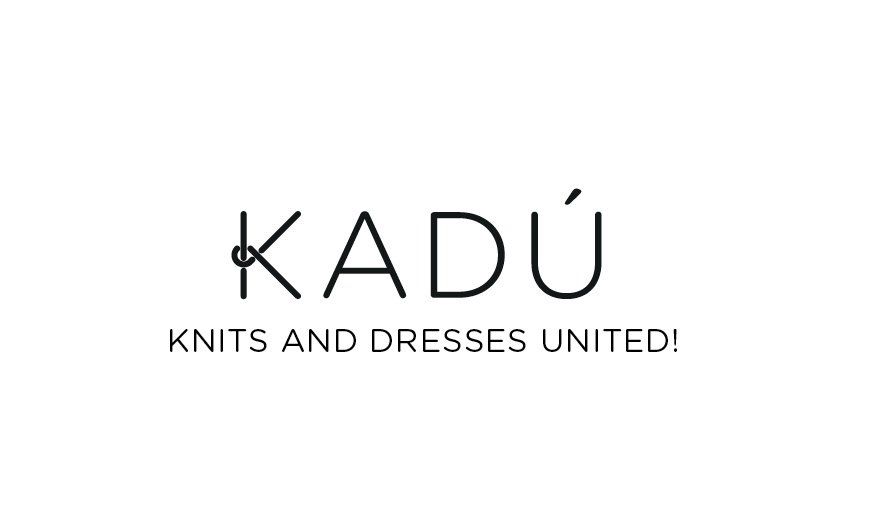
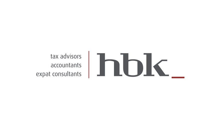
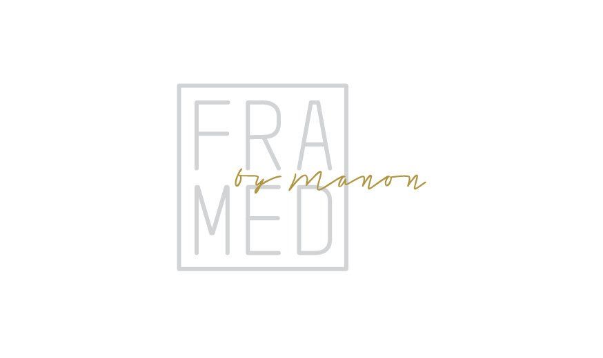
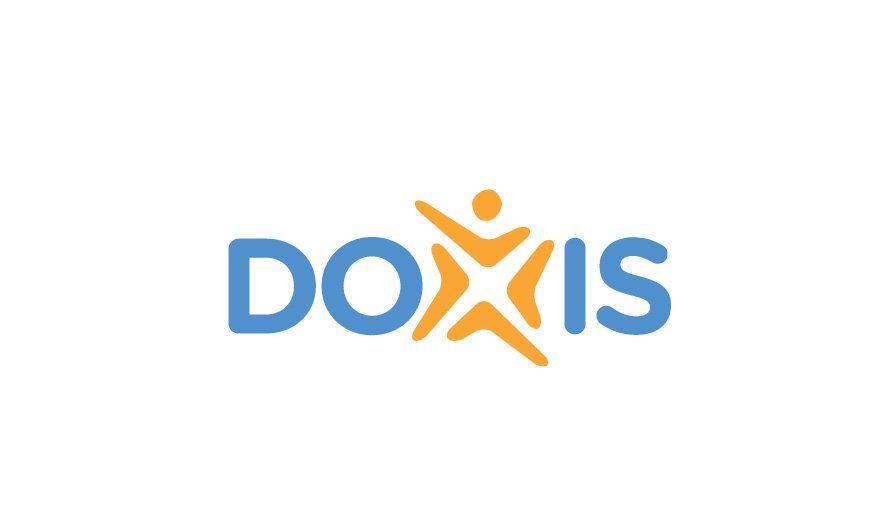
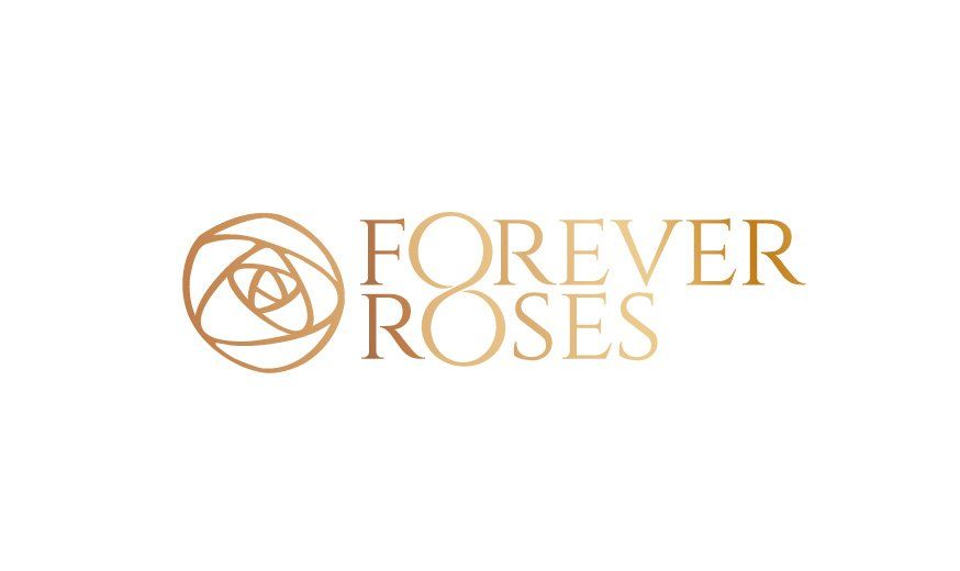
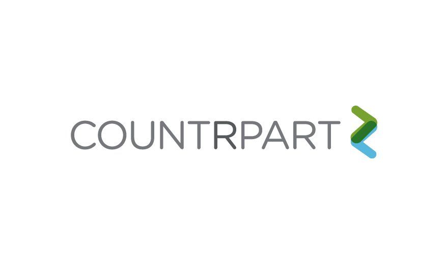
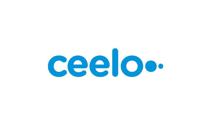
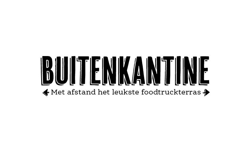
Here are a few recently developed logos:
Slide title
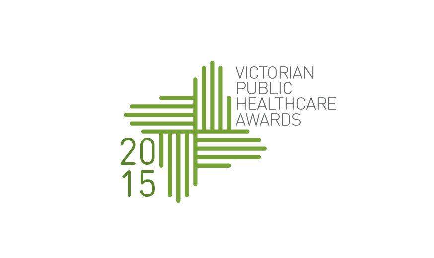
The Victorian Public Healthcare Awards is an annual celebration of excellence in public health services. The four hands forming the cross-shaped icon represent the many skilled people working in the healthcare community. The hands stand for the outreaching care and protection.
Button
Slide title
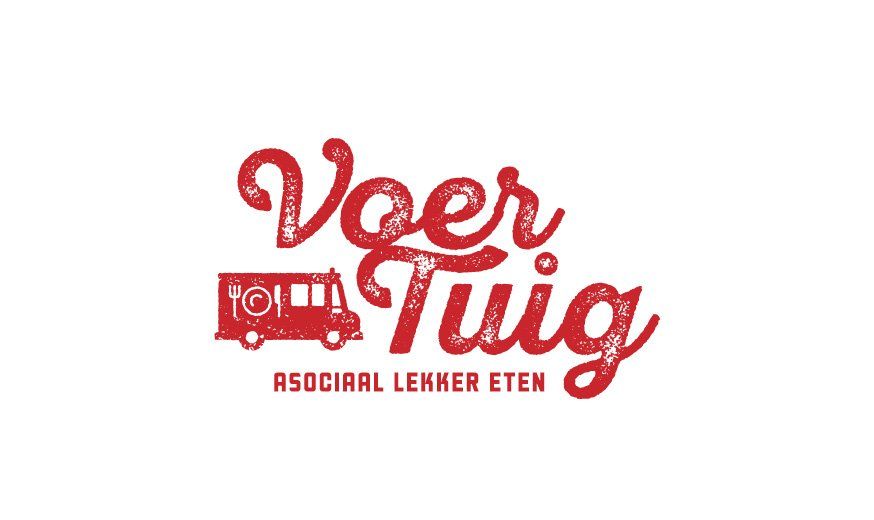
Voer Tuig is an old fire truck turned into a food truck. The name is a play of words in Dutch, meaning 'Vehicle' as well as the two words 'Feed' and 'Scum', while the tagline loosely translates into 'criminally delicious food'. The brandmark visually communicates the honest quality of their street fare.
Button
Slide title
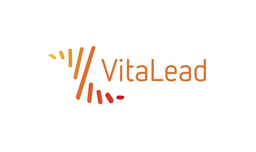
VitaLead offers strategic advice and creative solutions to all your sales issues and helps you translate into the best sales strategy. The transition process is clearly incorporated in the brandmark, resulting in the 'V' and the 'L'.
Button
Slide title
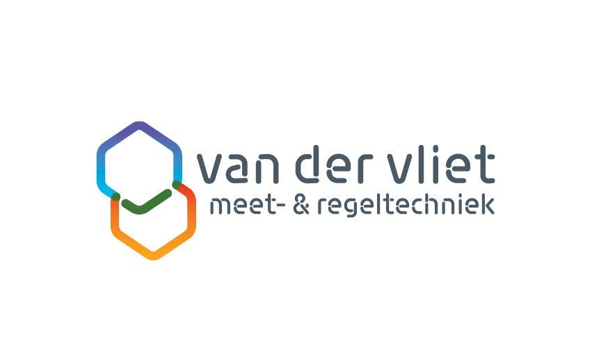
Van der Vliet is specialised in climatic measurement and control technology. The isometric cube shapes in orange and blue represent spatial climate control in the room. Where the blue and orange shapes overlap, a green check mark is created. With van der Vliet everything is "under control".
Button
Slide title
Write your caption here
Button

Slide title
Write your caption here
Button
Slide title
Write your caption here
Button
Slide title
Write your caption here
Button
Slide title
Write your caption here
Button
Slide title
Write your caption here
Button
Slide title
Write your caption here
Button
Slide title
Write your caption here
Button
Slide title
Write your caption here
Button

Slide title
Write your caption here
Button
Slide title
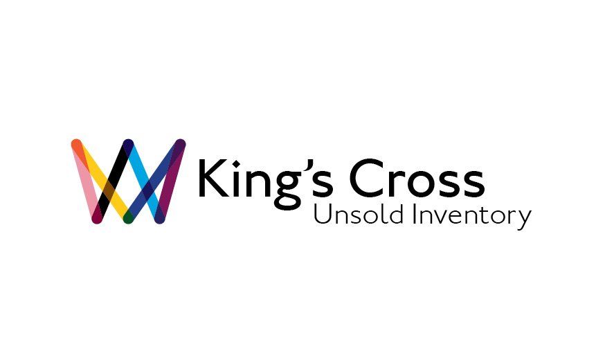
Kings Cross Unsold Inventory facilitates and organises 'barters'. The Icon is a literal visual translation of the company name with the lines crossing eachother, forming a crown and resembling the shape of London's King's Cross Station's roof.. The colours of the six lines are derived from the London Underground lines all coming together at King's Cross station. Th wordmark is set in the Johnston – the London Underground typeface.
Button
-

Slide title
Write your caption here
Button
Slide title
Write your caption here
Button
Slide title
Write your caption here
Button
Slide title
Write your caption here
Button
Slide title
Write your caption here
Button
Slide title
Write your caption here
Button
Slide title
Write your caption here
Button
Slide title
Write your caption here
Button
Slide title
Write your caption here
Button
Slide title
Write your caption here
Button
Slide title
Write your caption here
Button

Slide title
Write your caption here
Button
Slide title
Write your caption here
Button
Slide title
Write your caption here
Button
Slide title
Write your caption here
Button
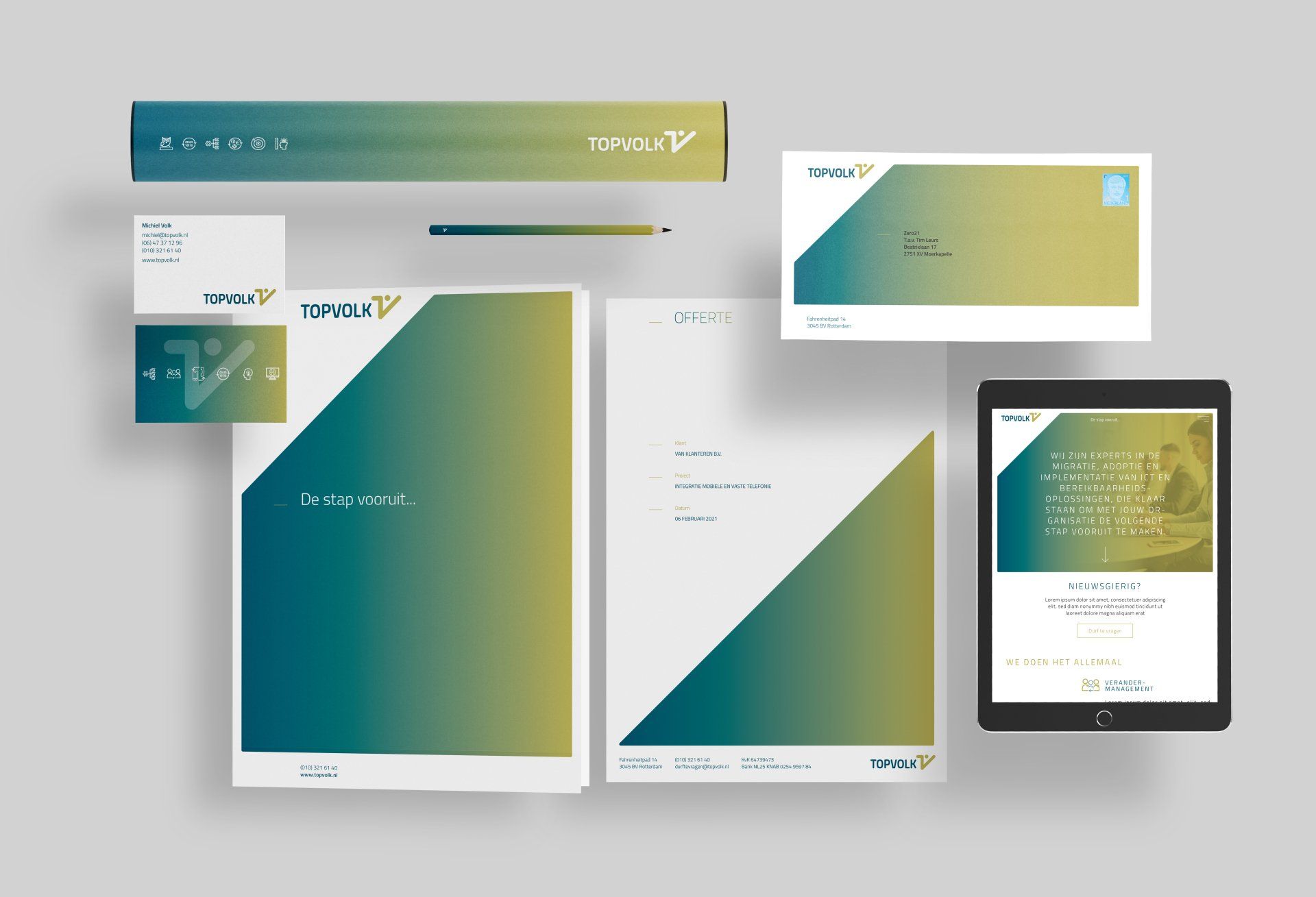
/// INTEGRATED AND CONSISTENT COMMUNICATION
In order to convey a message that is true to its beliefs, all brand assets – the typography, colour palette, iconography, photography, illustrations and tone-of-voice – need to be consistent. Holistically, from letterhead, business cards and envelopes, through website and social media content, to corporate signage and wayfinding.
Below are a few examples of how the Topvolk brand is translated into several brand assets, like animated pictograms and stationery items. A consistent story with the use of a distinctive visual language strongly positions Topvolk in the market and diversifies it from its competitors.

Slide title
Write your caption here
Button
Slide title
Write your caption here
Button

Slide title
Write your caption here
Button
Slide title
Write your caption here
Button